As modern web and mobile applications continue to evolve in complexity, creating scalable, maintainable, and reusable user interfaces is more important than ever. Choosing the right UI architecture pattern can make or break your development workflow. One of the most structured and increasingly popular methodologies is the Atomic Design pattern, introduced by Brad Frost. But how does it compare with other widely-used structuring patterns like feature-based architecture, flat component structures, or the smart/dumb component pattern?
In this in-depth post, we’ll compare Atomic Design with other UI structuring methodologies, explore its benefits and trade-offs, and provide guidance on when and how to implement it effectively in your own projects. By the end, you’ll have a clear understanding of why Atomic Design might be the better choice—especially for large-scale, design-system-driven applications.
And if you’ve ever cried while refactoring a spaghetti mess of components, this one’s for you.
Understanding Atomic Design: A Quick Recap
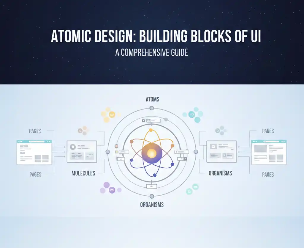
Atomic Design is a methodology for thinking about interfaces in a hierarchical and modular way, inspired by chemistry. It divides the user interface into five distinct levels:
1. Atoms
These are the basic building blocks of the UI, like HTML elements (label, input, button, etc.) or simple React Native components. They are highly reusable and represent the most fundamental level of design. Think of them like Lego bricks or the socks you never find in pairs.
2. Molecules
Molecules are combinations of atoms that work together as a unit. An example might be a search field consisting of a label, input field, and submit button. It’s like a sandwich—bread (input), cheese (label), and mayo (button). Delicious and functional.
3. Organisms
Organisms are more complex UI sections made up of groups of molecules and/or atoms. A navigation bar, user profile card, or product list is typically an organism. Basically, if it starts to resemble something a user might recognize, it’s probably an organism.
4. Templates
Templates focus on page structure. They define the layout using organisms, without tying them to specific content. Imagine a floor plan of a house before the furniture is moved in—structure without personal clutter.
5. Pages
Pages are the most concrete implementation, combining templates with real data to represent specific screens or routes. Now the couch is in, the posters are hung, and someone spilled coffee on the carpet.
Common UI Structuring Patterns: A Comparison
Before diving deeper into why Atomic Design might be better, let’s look at other common UI architecture patterns and how they compare.
1. Flat Component Folder Structure
This approach organizes components by type or general function. You might see folders like components/, containers/, screens/, etc. It’s simple and easy to start with, but becomes messy and hard to scale as your application grows.
Cons:
- Simple to understand
- Easy for small apps or MVPs
Cons:
- Poor scalability
Imagine your app grows from 5 to 200 components. It becomes impossible to tell which screen or feature uses which component, and you end up scrolling like a maniac or relying on search for everything.
- Hard to maintain with growing component count
You have 4 different modals: LoginModal, InfoModal, DeleteModal, and ShareModal—all dumped in one components/ folder. Now someone wants to refactor all modals to have a common footer. Good luck finding and updating them without breaking things accidentally.
- Difficult to ensure reusability
Your team creates three buttons:
-
- PrimaryButton.tsx
- BlueButton.tsx
- CTAButton.tsx
- PrimaryButton.tsx
They all look 80% the same, but no one noticed because they’re scattered in a huge folder. Now you have three almost-identical components—and three places to fix a padding bug. Yikes.
2. Feature-Based Folder Structure
This organizes code by feature or domain. For example, you might have folders like features/auth/, features/dashboard/, etc., each containing its own components, hooks, and logic.
Pros:
- Aligns with business logic
- Easier to scale and delegate work in large teams
- Encourages separation of concerns
Cons:
- UI component reuse across features can be more difficult
You build a UserAvatar inside the dashboard/ feature. Later, the chat/ feature needs the exact same component. But instead of reusing it, someone copies it into chat/components/UserAvatar.tsx. And now… you maintain it in two places.
- Often duplicates similar UI elements
Each feature builds its own Card.tsx component:
-
- dashboard/components/Card.tsx
- auth/components/Card.tsx
- billing/components/Card.tsx
- dashboard/components/Card.tsx
They differ slightly in margin, but now your design system is totally fragmented. And when the designer changes the card border-radius? Yep—you’ll have to update five versions manually. Hope you like regex.
3. Smart/Dumb Component Separation
This pattern separates components into:
- Smart components (containers) – Handle logic, data fetching, and state.
- Dumb components (presentational) – Focus solely on UI and props.
Pros:
- Encourages separation of concerns
- Makes UI easier to test and reason about
Cons:
- No specific structure for organizing components
You follow the smart/dumb split, so your folder looks like:
components/
containers/
ProductListContainer.tsx
presentational/
ProductList.tsx
…but then someone adds ProductCard, and another dev adds ProductCardContainer, and now you’re wondering if it belongs with the card or in containers?
Without additional structure like “atoms/molecules” or “features,” things get muddy real quick.
- Doesn’t inherently support design systems or visual hierarchy
You want to align with Figma components, where designers created:
-
-
Button
-
ButtonGroup
-
Card
-
FormSection
-
But your dumb components don’t follow the same visual hierarchy. Some dumb components are deeply nested, some are top-level, and there’s no sense of whether they’re foundational or composite.
It’s hard for new developers or designers to see how the pieces fit together—and easy to break consistency.
Atomic Design: A Pattern That Bridges Design and Development
Unlike the above patterns, Atomic Design is visually driven and aligns closely with modern design tools (e.g., Figma, Sketch). It’s particularly useful when building design systems, component libraries, or large-scale applications with a high degree of UI reuse.
It excels when:
- You’re building a design system
- Your app has hundreds of components
- You need strong collaboration with designers
- You want structured reuse across domains
Real World Example: The Login Form
- Atoms: Input, Label, Button
- Molecule: Labeled input field (label + input)
- Organism: Entire login form
- Template: Page layout with form and branding
- Page: Login screen with real text, imagery, and error states
Congrats! You just made your app modular.
Benefits of Atomic Design
1. Promotes Consistency Across the UI
Ever worked on a team where there were three different kinds of blue buttons?
The login screen has a “Login” button in sky blue, the sign-up page has a “Submit” button in navy, and the dashboard uses something mysteriously called “Brand Blue.”
With Atomic Design: You define one PrimaryButton atom and reuse it everywhere—blue chaos avoided.
2. Enables High Reusability
Stop reinventing the input field every time. Create once. Use forever. Thank us later.
Your TextInput atom becomes the core for login forms, comment boxes, search bars, and even your newsletter sign-up—like tofu, but for UIs.
3. Facilitates Collaboration Between Designers and Developers
Designers often create reusable UI elements in Figma or Sketch. Atomic Design maps almost 1:1 with this mental model, reducing miscommunication.
Designer: “Use the molecule with the input and label.”
Developer: “Ah yes, LabeledInputField. Got it.”
(Instead of: “Wait, which variant of the input are we using again?”)
4. Supports Scalable Testing
With well-defined component boundaries, unit tests can target atoms and molecules, while integration and E2E tests focus on organisms and pages.
You write unit tests for your Checkbox atom once. Later, when it’s used inside a FilterPanel organism, you don’t need to test it from scratch again.
You test smarter, not harder.
5. Improves Onboarding and Maintainability
New team members can easily understand where a component fits in the hierarchy, leading to faster onboarding and clearer code navigation.
New dev joins, sees /atoms/Button.tsx, /molecules/FormGroup.tsx, /organisms/LoginForm.tsx — and instantly knows the structure.
Less “What is this?” and more “Aha, got it!”
Challenges of Atomic Design
Despite its strengths, Atomic Design isn’t a silver bullet.
1. Too Much Overhead for Small Projects
If you’re building a to-do list app in a weekend, maybe skip the atoms folder.
2. Ambiguity in Classification
Teams sometimes debate: “Is this really a molecule?” Settle it over coffee or a foosball match.
3. Not Feature-Oriented
Atomic Design doesn’t directly align with application features or domains. This can be problematic in feature-heavy apps without additional structure.
Hybrid Approaches: The Best of Both Worlds
To mitigate its downsides, many teams adopt a hybrid architecture that combines Atomic Design with a feature-based structure.
Example:
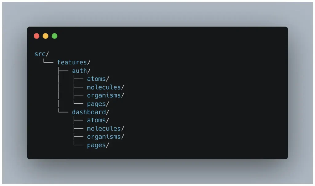
- This preserves both UI hierarchy and feature encapsulation
- Encourages reuse, but respects domain boundaries
- Helps in splitting teams (e.g., auth team, billing team)
This allows each domain or feature to have its own atomic structure, while still encouraging reusability and separation.
When Should You Use Atomic Design?
|
Use Case |
Is Atomic Design a Good Fit? |
|
Building a Design System |
Yes |
|
Small MVP or Prototype |
Probably Not |
|
Large Enterprise App |
Yes |
|
Feature-Heavy Business Logic |
Maybe (maybe consider feature-based approach) |
|
Solo Developer Project |
Simpler may be better |
|
Team Collaboration with Designers |
Chef’s kiss |
Implementation Tips and Best Practices
1. Start with a Shared Vocabulary
Ensure all team members agree on the definitions of atoms, molecules, and organisms. Create documentation if necessary.
2. Use a Monorepo or Shared Package for Design System
If your app has multiple teams or platforms (e.g., web and mobile), extract your atoms and molecules into a shared library.
3. Storybook or Component Library Tooling
Tools like Storybook are perfect companions to Atomic Design. They allow isolated development and documentation of atomic components.
4. Pair With Token Systems
Using design tokens (colors, spacing, typography) enhances the modularity of your atomic components.
Common Mistakes to Avoid
Even with all its shiny modular goodness, Atomic Design can backfire if misused. Let’s look at some common missteps—and how to avoid turning your beautiful design system into a Frankenstein folder structure.
1. Over-Classifying Components
Don’t create molecules just because the hierarchy exists. Not every div wrapped around two atoms needs a separate file, a name, and a zip code.
Bad Example:
You create a component called TextWithIconLabel that just renders:
<View>
<Text>Info</Text>
<Icon name=”info” />
</View>
…and declare it a “molecule” even though it’s only used once and doesn’t have any logic or styling.
Better Approach:
Just use Text and Icon inline unless the combo is reused across multiple screens and has meaning as a unit.
2. Ignoring Visual Intent
Atomic classification is not about component size or line count. It’s about purpose and visual meaning.
Bad Example:
You treat a ButtonGroup with three buttons as an organism just because it’s big.
Better Approach:
Ask: Does this feel like a complete UI section (organism), or is it just a functional cluster of atoms (molecule)?
If it’s reusable and functionally cohesive, it’s likely a molecule—even if it’s longer than your resume.
3. Not Enforcing Consistency
Atomic Design falls apart fast if every team member has their own interpretation of the rules. One person’s molecule is another’s organism. Suddenly, your atoms/Button.tsx file has 14 siblings like PrimaryButton, MainButton, LoudButton, and ShinyButtonWithIconV2.
Bad Example:
Your team ends up with:
atoms/
Button.tsx
IconButton.tsx
molecules/
Button.tsx
organisms/
SubmitButton.tsx
…because no one agreed on what a button actually is.
Better Approach:
Document what counts as an atom, molecule, or organism. Use design tokens. Set up lint rules or code reviews to enforce consistency.
Conclusion: Why Atomic Design Might Be the Better Choice
In today’s fast-moving development ecosystem, modular, testable, and scalable UI is no longer a luxury—it’s a requirement.
Atomic Design offers a well-structured, scalable architecture that:
- Aligns with design tools
- Promotes reusability
- Simplifies collaboration
- Scales well in large teams
Is it perfect? No. But is it a solid foundation for building beautiful, maintainable UIs across platforms? Absolutely.
If your app has:
- A design system
- Cross-functional teams
- Growing complexity
- Or a need for modular UI reuse
Then Atomic Design might just be the chemistry experiment your team needs.
Adopting Atomic Design isn’t just about folders—it’s about thinking in systems. And that kind of thinking scales.